
Traveler's Q Redesign Decisions
To showcase my design decisions, I used Before-After visuals to highlight the modifications that were implemented. These decisions are made in order to:
- make the content cohesively
- enhance the sophistication of the pictures
- employ more appealing colors
- use accessible typography
Main menu
- Changed the header color to black since the dark theme is decided for the website
- Picked white for the text color to provide enough contrast to the background
- Set the Title Case and lighter font for the menu options to increase legibility
- Moved the logo to the left side of the header to follow the website design standard
- Aligned the main menu to the left to make space for the search box on the right
- Added the search box next to the search icon to make the search process faster
Hero
- Shortened the hero section height to make sure users can see some part of the next section before scrolling the page
- Changed the hero image and hero message based on both target users needs
- Darkened the hero section to increase contrast to texts
- Changed the hero message color to stand out better
CTA
- Rounded the corners to make a modern looking
- Changed the color from blue to white to make the CTA more prominent on the darker background
- Added the golden border to make a luxury looking and also make a friction between the button and the background
- Changed the caption from "Contact Us" to "Plan Your Event" to increase users' motivation for clicking on the CTA
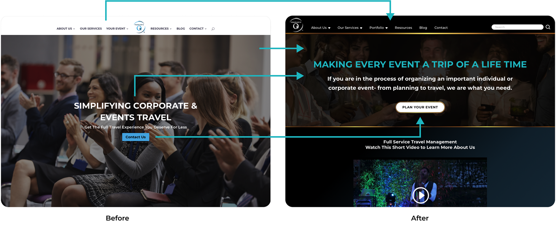
Main Menu, Hero and CTA - Before and After Redesigning
Cards
- Rounded the corners of the cards to make modern looking and consistent with the buttons
- Changed the background color to white for providing enough contrast to the text color
- Added the golden border to make a friction between the card and the background, and to make a luxury looking
- Added an icon related to the context to convey the message faster
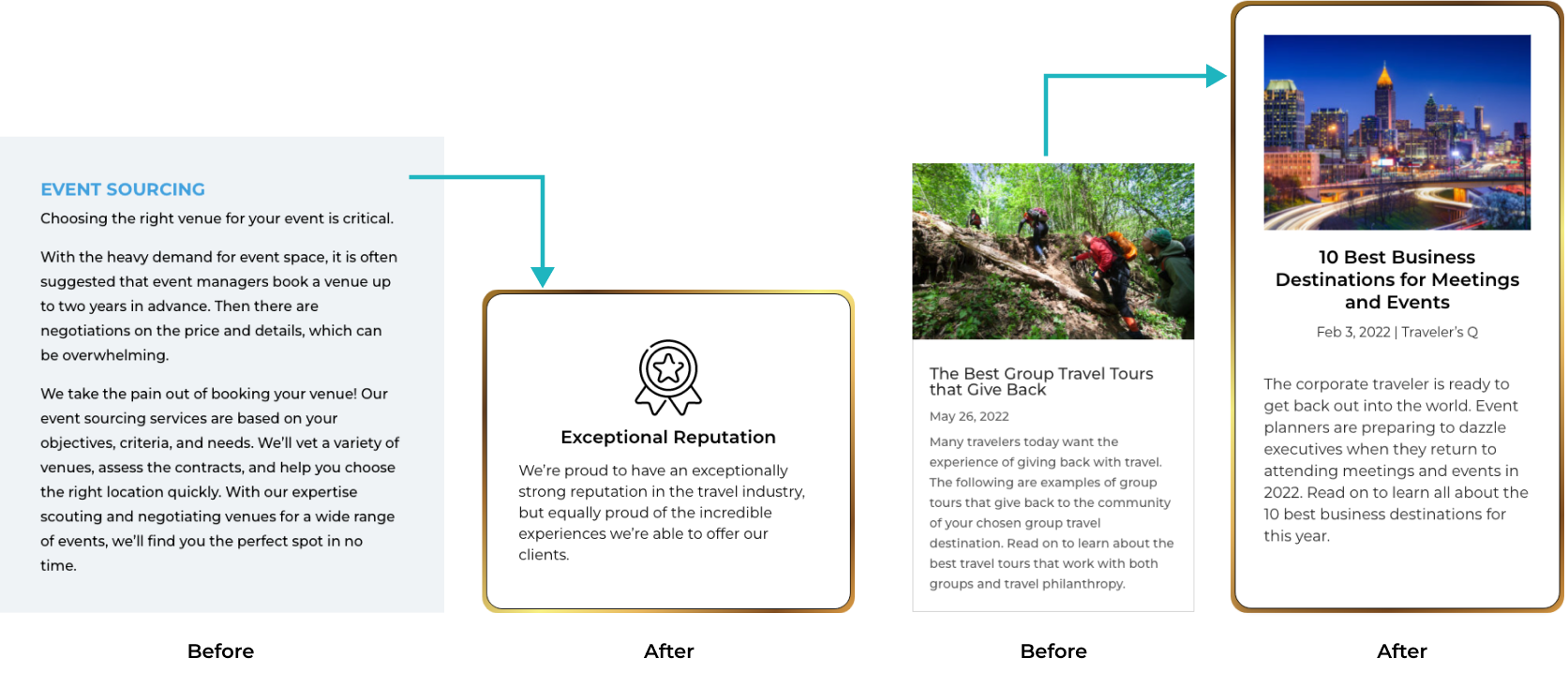
Cards - Before and After Redesigning
Text Boxes
- Rounded the corners to maintain the consistency with cards and buttons
- Added a thin border to demarcate them
- Changed the typeface of the text from Bold to SemiBold to increase the readability
- Change the ghost text color from black to gray to reduce distraction
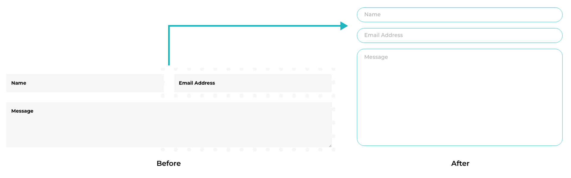
Text Boxes - Before and After Redesigning
Footer
- Changed the background color to be consistent with the header
- Enlarged texts to increase readability
- Removed the bullets since clutter the footer
- Moved the sponsors' logos to the bottom of the footer on a separate white background to help them stand out better
- Moved the Social Media buttons to the contact section of the footer
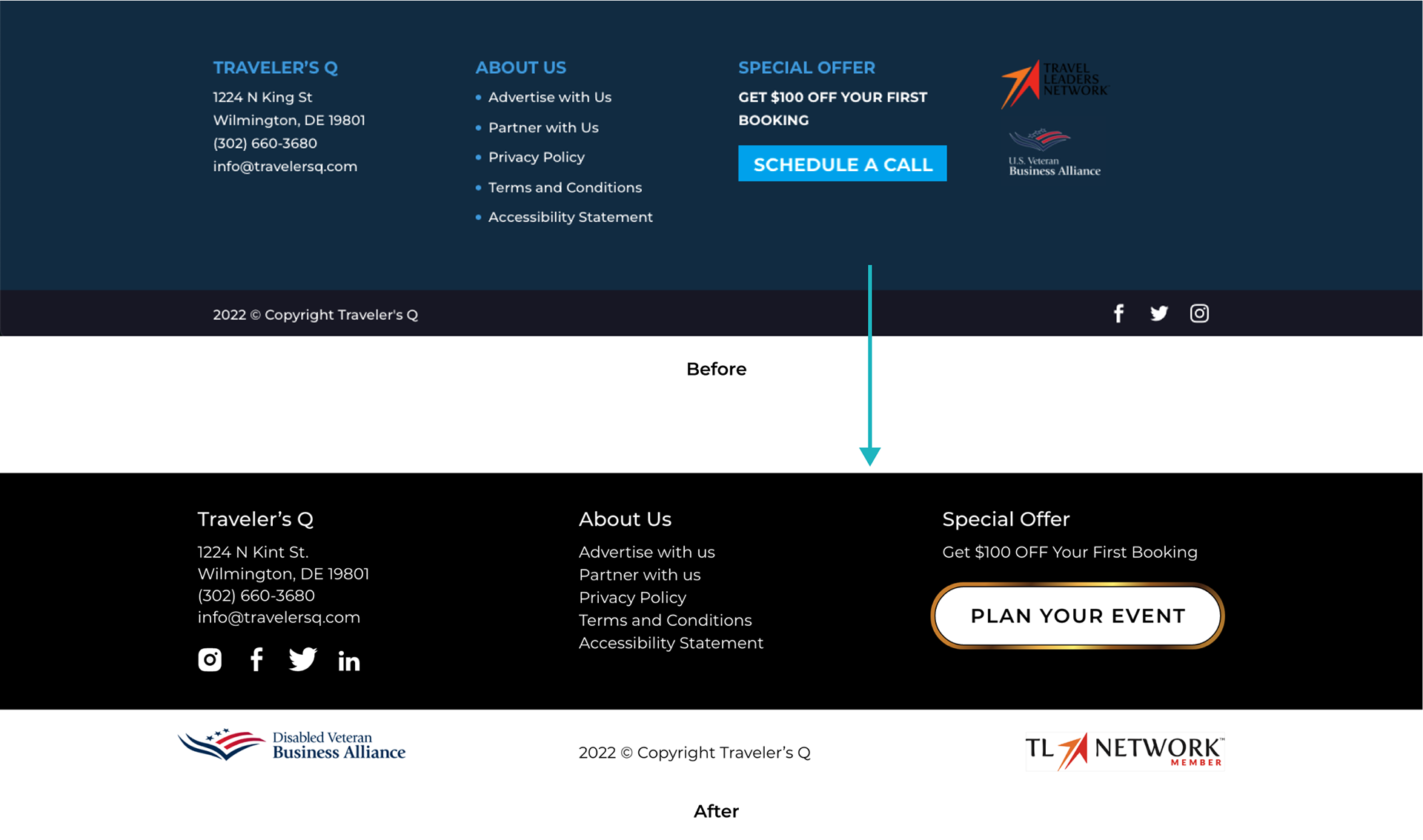
Footer - Before and After Redesigning